Let's
Keep it
Wild.

Welcome to the new look of
Northern Michigan University

First, check out the
process behind the look.

Using collective
feedback to move
NMU forward.

Realignment.

Our previous logo represents the beauty of NMU’s campus, but leaves out our entire academic community. As we realign our strategies to best serve the students of 2016 and beyond, we want to include all the aspects of what it means to be a student at NMU. Our marketing strategies will never move away from including the beautiful place that is our campus, but we want to reestablish NMU as an academic community and not just a recreational destination.

Representation.

In the past decade, we have seen new facilities, programs, students, alumni, staff, faculty and goals. To better represent where NMU is going, why would we identify ourselves with the early 1990s when our previous marks were instituted? Our campus is cutting edge, offers progressive programs for our students and is a great place for the Wildcats of tomorrow to enroll. We need an identity that better reflects our advancements.

Competition.

The market for higher education is more competitive than ever. As we constantly adjust our marketing strategies to encourage new students to attend Northern, we need to be proactive in competing for attention. A new logo gives us a competitive edge by not only "looking" modern, but it gives us a platform design growth beyond 2016.

Drum roll please...

Let's take a closer look.

Both Research
& Adventure

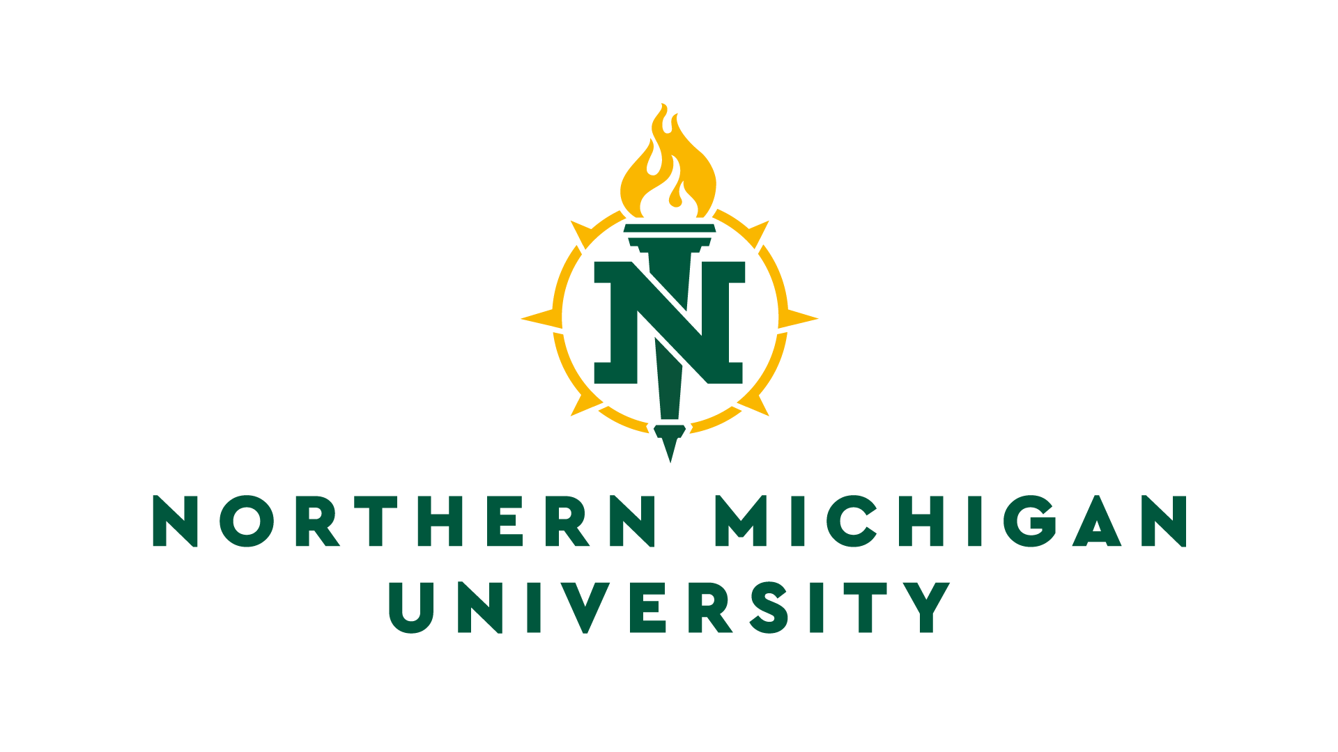
The “Torch of Knowledge” has been a symbol for research and the advancement of humanity through education. The torch symbolizes not only leadership, but the act of adventure. Most of our students will tell you that an education at NMU is truly for those who seek an adventure, both environmentally and socially.

Including the
History of NMU

Our initial seal in 1899 had a “sun” enclosure with the state logo of Michigan inside. We wanted to reference our history by including a new version of this sun, as it represents our connection to the surrounding nature of the Upper Peninsula of our beautiful state.

Connecting
our alumni base

With some subtle modifications to the “N”, this identity is not just for new students, but for those who have paved the way as well. The initial and torch is also aligned with our official academic seal adopted in the 1960s which remains in our academic identity package. Go ‘Cats!

Our location
remains key

The points on the sun reference a compass, aligning us with the “directional schools” from down state. This bridges the gap (pun intended) to our state education system, and as one of our alumni pointed out, the fire burns warmest in the north. The compass is a direct call-out to our beautiful location that is one of the strongest influencers for incoming students.

Let's talk
NMU athletics.

We’re Wildcats. We have pride in our athletics, and boast some of the best teams in our divisions. Our community felt that a new direction wasn’t necessary for the athletics brand, but a modernized update was. Our original logo is over 25 years old, and based on feedback, it was time for a change. Paying homage to our previous Wildcat logo that has historical meaning, this takes what works and moves us forward to the next decade of athletic recruits that will become our ‘Cats. Take a look at the new Northern Michigan University Wildcat Athletics identity.

Improved,
but not replaced.

Previous logo

Rickabaugh Graphics from Gahanna, Ohio has been in the business of graphic identity for over 25 years. With a portfolio that includes several high profile college and professional logos, NMU knew they were the right firm to move our identity forward.

NMU emphasized that the process of developing our new look was just as important as the end result. A collection of feedback and assessments from a wide variety of current and past Wildcats gave Rickabaugh Graphics a clear mission to move NMU forward:

Updated logo
  • Give our current Wildcat a modern update, as well as a typeface or “wordmark” unique to NMU Athletics.
  • Use our school colors of green and gold, red from the previous Wildcat identity, and white often seen in our home jerseys.
  • Provide our athletic community with something that feels stronger, more streamlined and can be replicated across mediums.
athletics logo with head athletics logo athletics logo abbreviation

The details

26.

That’s the number of years since NMU got its last graphic identity. Comparatively, successful companies like Pepsi, Google and Starbucks have rebranded an average of almost five times each in that same time period. Great brands recognize the importance of evolving with the times and creating an image that resonates with current, past and prospective stakeholders.

500+.

That’s the number of people who were involved in the logo process. From students to staff to faculty to alumni, every stakeholder group had an opportunity to steer the process to the final outcome. People were involved in the form of surveys, focus groups, information sessions, committees and one-on-one meetings.

16.

That’s the number of athletic teams we have at NMU that will be getting new looks. Over 95 percent of the student athletes involved with the logo process felt the update better represented the athletics programs at NMU. The new looks will put the ‘Cats on the same playing field as our collegiate competitors.

Cost.

The amount NMU paid for a new academic and athletic logo, along with 20 concepts, a new custom typeface and a mascot design was $35,000. This price tag comes at a great value when compared to the $80,000 paid by the University of Kentucky for their singular new design and the $128,000 paid by Penn State last year.

Why not create
an identity in-house?

We did not want a design that would represent one individual’s interpretation of what the visual identity for NMU should look like based on his/her personal connection to the university. We wanted an overall NMU interpretation gleaned from extensive research, as well as feedback from the many groups that have a vested interest in the outcome. The process in this case was as important as the result.

What was the process behind
the proposals?

When NMU embarked on a rebranding effort with Genesis a few years ago, we knew a revitalized identity program would be a required component. NMU formed a steering committee of alumni, local business owners, students, faculty and staff. A request for proposals (RFP) was sent out in December 2014 and the committee selected Rickabaugh. The firm visited in February 2015 to conduct interviews and obtain feedback on how NMU is perceived and how NMU describes itself. From there, Rickabaugh developed a variety of graphic identity options and presented them to the steering committee and campus leadership.

nmu logo