
Accessibility Categories
WCAG, the international standard for digital accessibility, has many requirements that fall under four basic categories:
- Perceivable - Ensure all information and interface elements can be perceived by users, including those using assistive technology. Make sure that your content is recognizable and understandable by all users.
- Operable - Users who cannot use a mouse rely on keyboard controls or other tools to navigate. To ensure full website interaction, content must be operable regardless of the user's tools.
- Understandable - Understandable websites use clear and concise language to make sure tasks can be completed and information can be understood. Users should easily understand how their actions affect the website’s response.
- Robust - Robust websites work across devices, browsers, and assistive technologies. This requires using universal formats and valid markup to support compatibility.
These principles form the acronym POUR. Following them ensures digital content remains accessible to all users.
Additional information and examples can be found in the Accessibility Guidelines Summary.
Alternative Text
Alternative text, or "alt text" acts as a description for images. The description should convey the same message or functionality as the image. All non-text content is required to have an equal text equivalent. In many cases when alt text is used, it is being read to the user. For that reason avoid "picture of..." or "image showing..." since this type of redundant description makes the text more difficult to process.
Complex Images
Complex images, like diagrams or infographics, should have a text description present on the page where the image is displayed or within an image caption.
Decorative Images
If an image does not convey information and is present only for decorative purposes it should not have alt text. Since a decorative image is not needed to understand the content of the page or use an application, having no alt text allows a screen reader to skip the decorative image.
Alt Text Resources
There are many different alt-text guides and tools available on the web. The following resources are a collection of tools and guides that can help generate and explain how to use alt-text for digital content successfully.
Alt Text Generators
AI-powered alt-text generators available on the web. The two links below are examples of such tools but they should be used only as a starting point when creating alt text for an image.
Alt Text Tutorials
- Alternative text tutorial by WebAIM.
- The Image concepts tutorial by the W3C Web Accessibility Initiative.
Alt Text Within Drupal
NMU's content management system, Drupal, provides alt-text input for all images and media elements. Card-based media elements also have alt text input and a 'decorative image' option. Editor-based images provide an option to indicate if an image is decorative.
Captions
Captions provide text that is synchronized with video content to allow equal access for deaf and hard-of-hearing users. Captions also enhance the video experience for non-native language speakers or users in a noisy environment.
Podcasts and audio files should include a transcript of the audio content. The transcript can be provided via link or included on the same page.
Caption Resources
- Captions, Transcripts, and Audio Descriptions by WebAIM.
- Transcripts by W3C Web Accessibility Initiative.
Color
Color alone should not be used to convey information on digital content. For example, a required field on a form, a specific area in a map, or different sections of a chart. If color is used, additional visual cues should also be used to provide the same information.
Examples of visual cues to use in addition to color:
- Text cues: "Important" or "Required".
- Font styles: bold or italics.
- Underlines: should be primarily used for links.
- Patterns: used to distinguish areas of a chart or map.
Contrast
When choosing colors to use in digital content, or when adding text that will overlay an image, the contrast between the text and the background color must meet a specific ratio depending on the usage.
- ‘Large scale’ text needs a contrast ratio of at least 3:1.
- Text that is not ‘large scale’ needs a contrast ratio of at least 4.5:1.
‘Large scale’ text is defined as text larger than 18pt/24px, or 14pt/18.5px and bold.
Contrast Resources
Headings
Headings provide structure to a document and give context to the content that follows. Assistive technologies use headings to create an outline, allowing users to navigate quickly and efficiently. For all users, headings offer a way to scan and locate relevant sections, improving the overall usability of the content.
Writing Meaningful Headings
What a heading says matters just as much as the fact that you used one. Headings like 'More Information' are too vague, while something like 'Understanding Why Headings Are Important and How You Can Write Better Headings' is too long to be useful. Aim for headings that are clear, concise, and specific to the content that follows.
Heading Hierarchy
When applying headings in a document, hierarchy matters. Every page should start with a Heading 1 (H1), followed by Heading 2 (H2), Heading 3 (H3), and so on. Headings should be nested to reflect the structure of the content. For example, an H2 might introduce a new section, with multiple H3s used to divide that section into smaller parts.
A common heading structure might look like this:
- Heading 1
- Heading 2
- Heading 3
- Heading 3
- Heading 2
- Heading 3
- Heading 4
- Heading 4
- Heading 3
- Heading 3
- Heading 2
It’s also important to remember: visual appearance should not determine heading level. Just because a certain heading style looks smaller or more appealing doesn't mean it should be used. Choosing a Heading 4 where a Heading 2 is needed breaks the logical structure of the page—and that can cause confusion, especially for users navigating with assistive technology.
Headings Resources
- In-Depth Heading Guide by WebAIM
- Semantic Structure: Regions, Headings, and Lists by WebAIM
Headings within Drupal
In NMU’s content management system, Drupal, a Heading 1 (H1) is automatically applied to the page title. As a best practice, each web page should have only one H1, and it should represent the main content of the page. The page title serves this purpose, which is why Drupal reserves H1 for that field.
In the Drupal editor, Heading 1 is not available as a formatting option. The first selectable heading is Heading 2 (H2). For content cards or sections without a pre-defined title field, H2 is typically where your heading structure should begin. For cards that already include a title field (and therefore an H2), your content headings should start at H3 to maintain proper hierarchy.
Choosing the right heading level can be tricky. Tools like the HeadingsMap browser extension can help identify heading hierarchy and are recommended when reviewing your pages for accessibility.
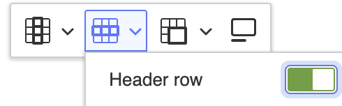
Table Headings
Tables are used to organize data with a logical relationship in grids. To ensure a table is accessible, table headers should be used to define the relationship between the data and the labels that describe that data. Within Drupal, a row or column can be assigned as a table header using the built-in row or column controls. The image below shows the toggle control used to identify a table row.
Links
When including links in digital content, it's important to ensure they are accessible to all users and function effectively across various formats, whether viewed on screen, read aloud by assistive technology, or printed.
Descriptive Links
Link text should clearly describe the destination or purpose of the link. Phrases like "Click here" or "More information" are vague and should be avoided. Instead, use text like "Campus Visit Program" or "Parking Map", which helps all users, especially those using screen readers, understand where the link will take them.
URLs as Links
Unless your content is intended for print, avoid using raw URLs as link text (for example, nmu.edu/admissions). Screen readers often read URLs character by character or word by word, which can be confusing and tedious. Descriptive link text also improves search engine performance by helping search engines better understand and categorize content.
For printed materials, it’s appropriate to include both a descriptive link and the URL. For example:
NMU Admissions Office (nmu.edu/admissions).
Concise Links
There’s no strict rule for link length, but links should be concise while still conveying meaning. Overly long links can make it harder for users, especially those using screen readers, to skim or navigate efficiently.
Images as Links
When an image serves as a link, its alternative (ALT) text must describe the link’s destination or purpose. Avoid redundant phrases like "Link to..." in the ALT text. If the image also conveys important meaning beyond the link (such as a logo or infographic), the ALT text should include that context as well.
Link Styles
Links should be visually distinct from surrounding text. Common styling includes color, underlines, and hover effects. If using color alone, ensure the link text has sufficient contrast against both the background and surrounding text. If underlining is used for non-link text elsewhere, make sure links include at least one additional distinguishing feature, such as color or bolding, to prevent confusion.
Additional Resources
- Link Purpose from the Accessibility Guidelines Summary
- Links and Hypertext by WebAIM