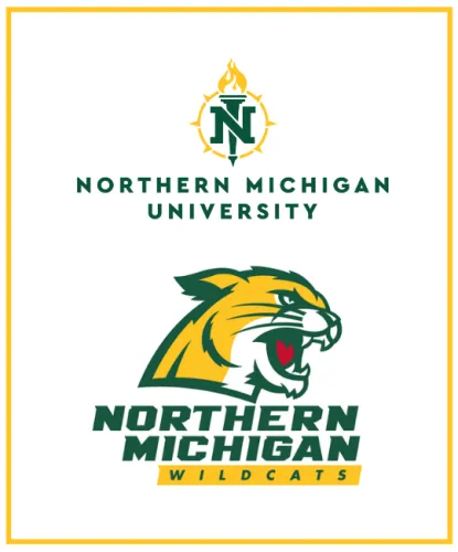
NMU's Graphic Identity
As a part of a comprehensive graphic identity program, a consistently used identifying mark helps to establish, convey, and reinforce desired, memorable images; generates internal pride and support; and eliminates confusion in the minds of target audiences. NMU has separate academic and athletic logo packages. Both marks are intended to represent Northern’s rich history and provide a platform to move the brand forward.
The identity system outlined in the manuals on this page will help ensure that the university’s many diverse parts have visual consistency. All of those responsible for the production of visual communications produced by or for Northern Michigan University departments, offices or organizations are expected to follow the guidelines set forth in this manual.
We realize that no graphic identity standards manual can cover all situations. Should you have a question, please do not improvise solutions without consulting University Marketing and Communications. If you require vector logo files or departmental logos, please contact UMC.
Our Academic Logo Explained
The visual image reflected by the Northern Michigan University signature plays an integral role in communicating the mission of our institution. The free-flowing lines reflect the open and friendly nature of the university and its people. The use of the green and gold colors represent warmth, growth and the surrounding environment. The lines pass through the symbol to illustrate openness and an invitation to new ideas and unrestricted thought. The traditional type style used for the words “Northern Michigan University” reflects our academic heritage and traditional values. Overall, our signature proclaims our pride in academic excellence, our commitment to established traditions, and our willingness to grow.
Our current logos were unveiled in 2016.
NMU Logos for Media/External Use
- Academic Logo - PNG
- Academic Logo - JPG
- Academic Logo Light Background - PDF
- Academic Logo Dark Background - PDF
- Academic Logo - TIF
- Athletic Logo - PDF
- Athletic Logo - PNG
If you need other versions of the logos please contact us at commark@nmu.edu or 906-227-2720
